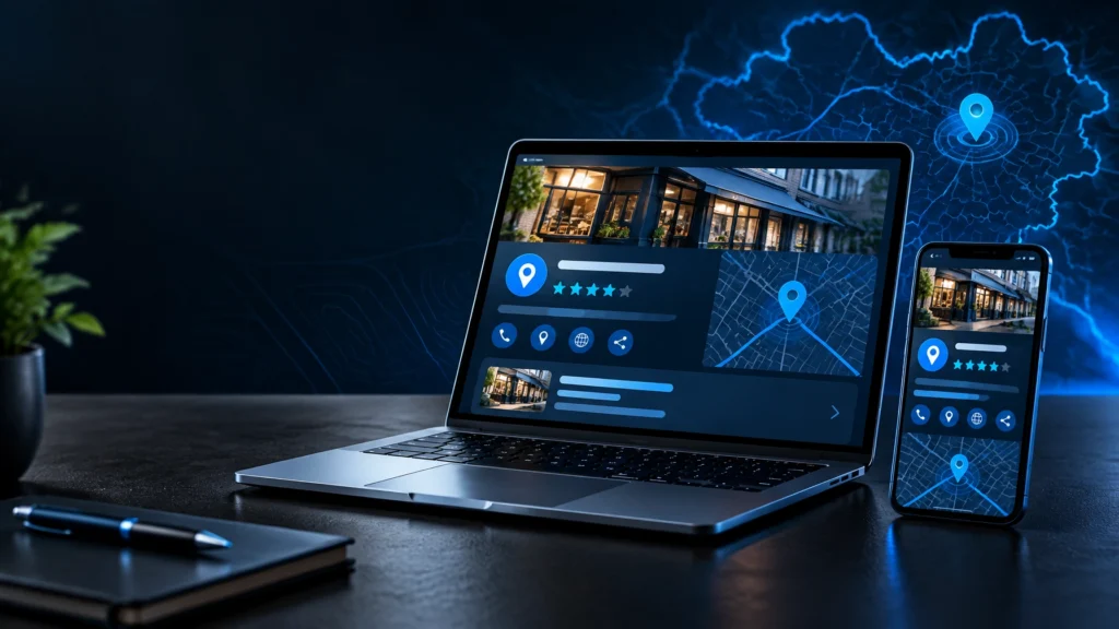
A client can decide whether your salon feels right before they see the reception desk, sit in a chair or meet a stylist. That is why web design for hair salons is not a digital brochure exercise. It is a commercial tool that needs to translate your look, standards and personality into booked appointments.
For independent salons and growing groups alike, the strongest website makes a clear promise quickly: this is the place for the result you want, with people you can trust, at a location and price point that work for you. Every page should support that decision.
A salon website has one job before anything else
Beautiful editorial photography matters. A distinctive colour palette matters. But if a potential client cannot find a service, understand who it is for or make a booking without friction, the site is underperforming.
A high-performing salon website balances brand expression with practical decision-making. Visitors should be able to identify the salon, see the work, check relevant services, understand the experience and book from their mobile in a matter of moments. This is especially important for new clients, who may be comparing several local options between appointments, commutes or evening plans.
The goal is not to cram every treatment, team member and social post onto the homepage. The goal is to create a confident path towards an appointment.
Start with the positioning, not the homepage layout
Many salon websites look polished but interchangeable. They use the same muted tones, oversized type and generic imagery, then wonder why they do not communicate a reason to choose them. Design should make the salon’s position clearer, not simply make it look more fashionable.
Before selecting a layout, establish what the business is known for. It may be precision cutting, lived-in colour, textured hair, restorative treatments, luxury service or accessible expertise for busy professionals. It could also be a particular atmosphere: quiet and considered, energetic and social, or technically focused.
That positioning should shape the words, image direction, navigation and booking journey. A colour specialist, for example, needs visual proof of outcome and a clear consultation route. A salon with a broad family offering may need clearer service categories, pricing guidance and practical information. The right approach depends on the business model, not a passing design trend.
Build a brand clients can recognise before they read
The best salon brands have a point of view. Their photography has a consistent standard, their language sounds like a real team, and their visual identity works across the website, signage, appointment cards and social channels.
Avoid relying solely on stock imagery or heavily filtered social content. Real work, photographed with care, carries more weight. It demonstrates capability while giving clients a realistic sense of the salon’s style. A custom website should create room for that work to lead.
Design the homepage around intent
A homepage does not need to tell the entire story. It needs to answer the first questions decisively. What does this salon offer? Who is it for? Where is it? How do I book?
The opening section should feature a strong visual, a concise value statement and a visible booking action. Vague lines such as “bringing your hair dreams to life” consume valuable space without offering a reason to act. A sharper message could reference specialist services, a recognisable result or an elevated salon experience.
From there, guide visitors towards the proof they need. A focused introduction to key services, selected portfolio work, stylist expertise, client reassurance and location details are usually more useful than a long brand manifesto. Keep the booking option present throughout, particularly on mobile.
Make service pages work harder
Service pages are where interest becomes confidence. Rather than listing “cut and finish” or “balayage” with a price alone, explain what the service involves, who it suits, what affects timing or cost, and how clients should prepare.
This does not mean turning every page into an essay. Clear copy and considered structure are enough. A new colour client may need to know whether a patch test or consultation is required. Someone booking a restyle may want to see the stylist’s approach and indicative pricing. Useful detail reduces uncertainty and filters out unsuitable bookings.
Where prices vary, be transparent about the starting point and why. Ambiguity can protect against awkward conversations in the short term, but it often creates booking hesitation and dissatisfied clients later.
Mobile-first web design for hair salons is non-negotiable
Most salon journeys begin on a mobile. A client sees a result on social media, searches for the salon, checks availability and books while standing in a queue or winding down at home. If the site is slow, text is hard to read or buttons are too small, that opportunity disappears quickly.
Mobile-first design means more than making a desktop site shrink to a smaller screen. Navigation should be easy to reach, service information should scan clearly, forms should ask only for essential details, and imagery should load without holding the page hostage.
Large image files are a common problem for visually led businesses. High-quality imagery is essential, but it must be properly prepared for the web. The trade-off is simple: a full-screen image can create impact, but not if it delays the page long enough for visitors to leave. Strong development preserves visual quality while protecting speed.
Connect the booking experience properly
Your booking platform is part of the website experience, even if it is provided by a third party. A sudden switch to a mismatched page, confusing treatment names or unnecessary steps can weaken the confidence built by the site.
The booking route should be tested from a client’s perspective. Can a visitor select a stylist? Is the difference between services clear? Are deposits, cancellation terms and consultation requirements explained before the final step? Does the confirmation feel on-brand and useful?
Not every salon needs a complex integrated system. For some, a clear enquiry form for colour consultations and a direct booking route for established services is the better setup. What matters is that the route reflects how the salon actually operates.
Use trust signals with restraint
Hair is personal. New clients want evidence that they will be heard, looked after and capable hands will handle the result. The website should answer that emotional question without overselling.
Introduce the team with useful detail: areas of expertise, experience, preferred services and a sense of individual style. Showcase before-and-after work where appropriate, using consistent photography and honest captions. Client reviews can add reassurance too, provided they are selective and readable rather than presented as a wall of praise.
Practical trust signals matter just as much. Include a clear address, opening hours, contact options, accessibility information where relevant, and straightforward policies. For salons serving Rochdale, Greater Manchester or nearby towns, precise location information can also help clients decide whether the journey is worthwhile.
Build visibility into the structure
Search visibility should be considered while the site is being planned, not added as a layer after launch. This begins with a sensible page structure: dedicated pages for core services, accurate page titles, descriptive headings and locally relevant information where it genuinely serves the user.
A single page attempting to rank for every hairstyle, treatment and nearby town will rarely provide a strong experience. It is better to create useful, focused pages that match genuine client searches. A page for colour correction, for instance, should explain the process and consultation expectations rather than merely repeat the phrase several times.
Local visibility also depends on consistency. The salon name, address, phone number and opening details should align across the website and other customer touchpoints. Small inaccuracies create doubt for both search engines and prospective clients.
Give the website room to evolve
A salon is not static. New team members join, services change, work improves and seasonal campaigns come and go. A bespoke website should make routine updates manageable without compromising the design system.
Plan for the content that will need attention after launch: portfolio images, team profiles, service prices, promotions and policy changes. Assign ownership internally, or retain ongoing support. An abandoned journal is not essential, but an out-of-date price list or departed stylist is actively damaging.
The same applies to measurement. Track the actions that matter: booking clicks, consultation enquiries, calls, directions requests and completed booking journeys where possible. Traffic alone is not the measure of success. A smaller number of well-qualified visitors who book is more valuable than a large audience that never reaches the chair.
A site that reflects the standard behind the chair
Good web design for hair salons creates a consistent experience before, during and after the booking decision. It should feel as considered as the consultation, as clear as the service menu and as confident as the work clients leave with. When strategy, visual identity and technical performance are aligned, the website stops being a maintenance task and starts earning its place in the salon’s growth.