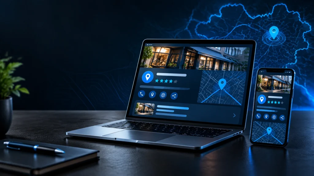
A website is often the first proper meeting between your business and a potential customer. For Rochdale web design to earn its place in your growth plans, it needs to make that meeting count: clarify what you do, establish confidence quickly and give people a clear reason to take the next step.
A visually polished site is valuable, but polish alone does not create enquiries. The strongest websites combine clear positioning, considered user experience, technically sound development and content built around how customers actually search and decide. That is where custom design starts to outperform a generic template.
What Rochdale Web Design Should Actually Deliver
A business website has a practical job. It should help the right people understand your offer without effort, recognise why you are credible and contact you with confidence. Every layout, message and interaction should support that outcome.
For a local service business, this may mean making areas served, specialist services and proof of work easy to find. For an established company with a more complex offer, it may mean creating a clearer route between services, sectors and case studies. The details vary, but the principle stays the same: the site should reduce uncertainty rather than add to it.
Good design creates hierarchy. Visitors should see the most useful information first, not be forced to hunt through oversized banners, vague statements or crowded navigation. Strong headings, purposeful calls to action and well-placed evidence help users move forward naturally.
That evidence matters. Testimonials, project examples, accreditations, process details and strong photography can all increase trust, provided they are relevant and presented with restraint. A site does not need to make every claim loudly. It needs to make the right claims believable.
Start With Positioning, Not Page Templates
Many website projects go wrong before the first screen is designed. The business starts with a list of pages or a favourite competitor site, rather than asking a more useful question: what must a visitor understand about us within the first minute?
Positioning gives the website its direction. It defines the audience you want to attract, the problem you solve, the standard you work to and the reason someone should choose you over an alternative. Without it, even a beautifully built website can feel interchangeable.
This is particularly relevant in competitive local markets. If every business says it is reliable, professional and friendly, those words lose their force. Specificity does the work instead. Explain the type of project you are best suited to, the depth of your experience or the way your service removes friction for the client.
A thoughtful discovery stage should shape the site architecture, page messaging and visual direction. It also prevents a common mistake: trying to speak to everyone. A website can be broad enough to support growth while still being precise about its best-fit customers.
Your homepage is a decision page
The homepage does not need to tell the entire story. Its job is to orient visitors and direct them to the next useful piece of information. A strong opening section normally states what you offer, who it is for and what makes the offer worth considering.
From there, the page can introduce key services, proof, selected work and a direct contact route. The order should follow user intent, not internal company structure. Customers rarely care how your departments are arranged. They care whether you can solve their problem.
Design for Attention, Then Design for Action
Visual identity has a commercial role. It sets expectations before a single paragraph is read. A dated, inconsistent or overly generic interface can make an otherwise capable business appear less established than it is. Equally, an overly decorative site can bury essential information beneath style.
The best balance is refined and functional. Typography should be readable across devices. Colour should support brand recognition and contrast, not simply fill space. Images should contribute to the message, whether that means showing the people behind the business, the quality of completed work or the environment customers can expect.
Calls to action deserve the same care. “Get in touch” is useful, but it is not always the strongest prompt. Depending on the service, “Request a quote”, “Book a consultation” or “Discuss your project” may set a clearer expectation. The right choice depends on the level of commitment being asked for.
Too many calls to action can be as unhelpful as too few. If every section demands attention, nothing feels important. Prioritise the primary route to enquiry, then give visitors quieter alternatives such as viewing work, reading about a service or checking frequently asked questions.
Build for Mobile Users and Search Visibility
A large share of visitors will encounter your website on a phone, often while comparing several providers. Mobile design is not a reduced version of desktop design. It requires its own decisions around spacing, navigation, tap targets, image use and the order of content.
Contact details should be simple to access. Forms should request only what is needed to start a conversation. Key messages should remain clear without relying on hover effects, dense tables or blocks of small text. If a mobile visitor cannot understand your offer quickly, a more elaborate desktop experience will not compensate.
Search visibility is also shaped by structure and substance. A well-designed website gives search engines clear signals through meaningful page titles, service-led content, sensible headings and fast, accessible code. It should not rely on repeating location names in every paragraph.
For Rochdale businesses, locally relevant content can be useful when it adds genuine proof of coverage or experience. A dedicated service page, a relevant case study or accurate business information can support local visibility. Forced place-name repetition, however, reads poorly and rarely creates a better experience for the customer.
Technical quality sits behind the scenes but affects everything. Slow pages, unstable layouts, broken links and inaccessible controls create friction for users and can limit performance in search. These areas are less visible than a new visual style, yet they are central to a website that works hard after launch.
Custom Development Gives You More Control
Templates can be a sensible option for a very early-stage business with a limited budget and a straightforward offer. They can get a basic presence online quickly. The trade-off is that templates often impose design limits, carry unnecessary code and make it harder to create a distinct brand experience.
Custom web design begins with the business rather than a pre-set layout. It allows the design system, page structure and functionality to reflect what the organisation actually needs. That could mean a tailored quotation journey, a service finder, flexible case study pages or a content structure that supports ongoing SEO work.
Custom does not mean adding features for their own sake. Every function adds build time, maintenance requirements and potential points of friction. The goal is not a website with the most moving parts. It is a website with the right parts, executed properly.
At DBL Designs, strategy, brand thinking, design and development can be considered together rather than handed between separate suppliers. That joined-up approach helps protect the original idea through to launch, while keeping performance and usability in view.
Treat Launch as the Start of Improvement
A website should not be left untouched once it goes live. Customer behaviour changes, services evolve and new opportunities emerge. Regular review keeps the site aligned with the business it represents.
Start by paying attention to the questions sales teams receive repeatedly. If prospects regularly ask about pricing structure, lead times, service areas or how a process works, the website may not be answering those questions clearly enough. Adding the right information can improve lead quality as well as conversion rate.
Review the pages that attract traffic, the routes users take and the points where enquiries drop away. Sometimes the answer is a new page or sharper content. Sometimes it is as simple as improving a form, replacing weak imagery or making a call to action more visible.
The most effective Rochdale web design is not defined by trends or effects. It is defined by clarity, confidence and a clear path from first impression to meaningful action. Build around those principles, and your website becomes a stronger part of how the business is seen, found and chosen.